Blåhaj Lemmy
  • Communities
  • Create Post
  • Create Community
  • heart
    Support Lemmy
  • search
    Search
  • Login
  • Sign Up
Jaettehjort@lemmy.worldM to Vexillology@lemmy.worldEnglish · 3 years ago

Minnesota is in the process of proposing a new state flag. Here are some proposals, circulating online. Many feature the North Star, a symbol of the state.

files.catbox.moe

message-square
54
link
fedilink
115

Minnesota is in the process of proposing a new state flag. Here are some proposals, circulating online. Many feature the North Star, a symbol of the state.

files.catbox.moe

Jaettehjort@lemmy.worldM to Vexillology@lemmy.worldEnglish · 3 years ago
message-square
54
link
fedilink

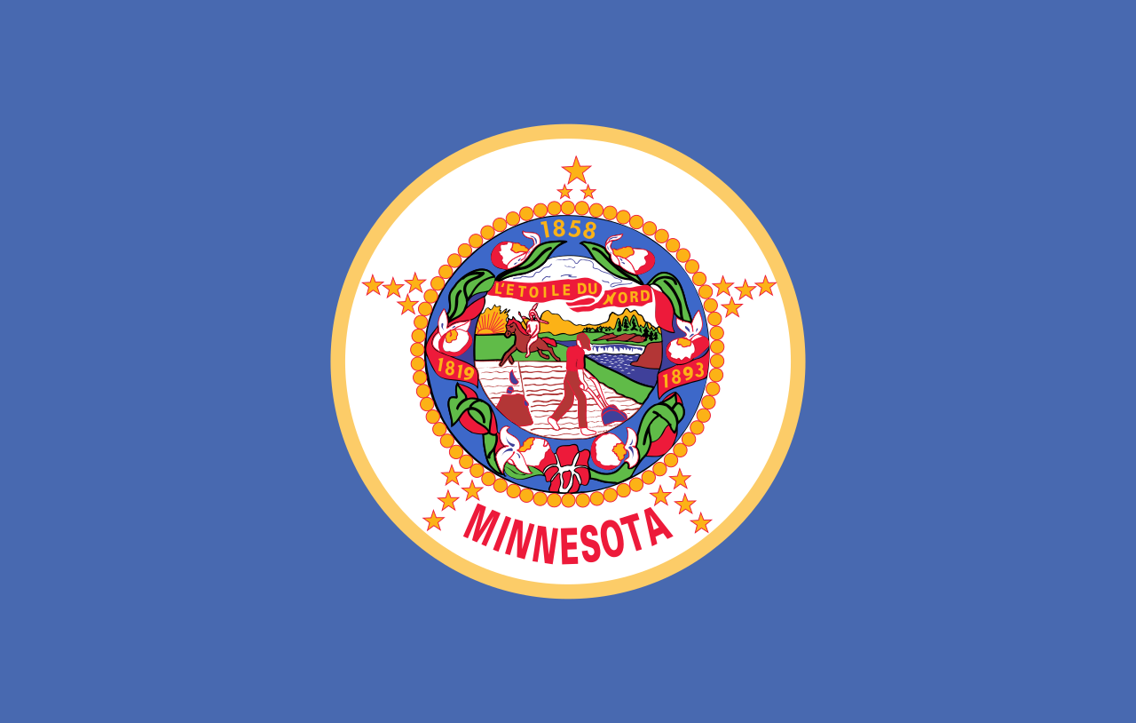
The current flag looks like this, which obviously needs changing: SoB Minnesota flag

There is a commission tasked with proposing a new design. A news article about it is available here: https://www.cbsnews.com/minnesota/news/minnesota-house-bill-moves-forward-commission-to-redesign-state-flag-and-seal/

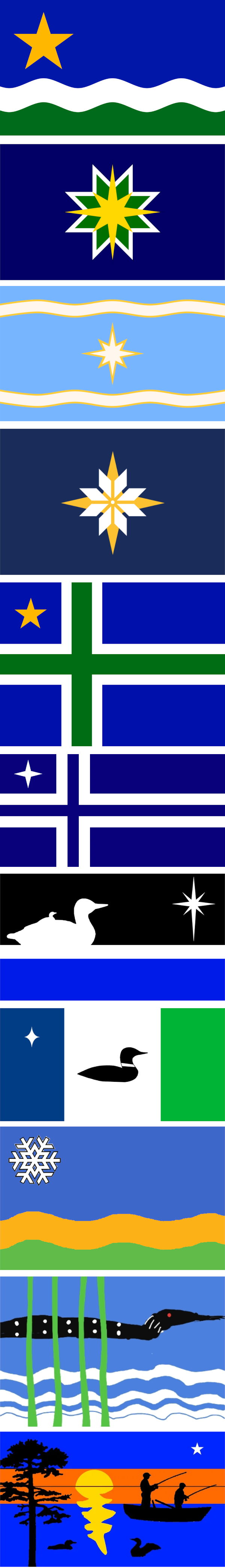
The top proposal, called “The North Star Flag”, seems to be a popular favorite.

I gathered these proposals from these two sites: https://newmnflag.org/designs https://vexillology.fandom.com/wiki/Minnesota

alert-triangle
You must log in or # to comment.
  • Urbanfox@lemmy.world
    link
    fedilink
    English
    arrow-up
    37
    ·
    3 years ago

    Is this because they got slagged off by CGP Gray?

    • gramathy@lemmy.world
      link
      fedilink
      English
      arrow-up
      1
      ·
      3 years ago

      If CGP Gray slagging off shite flags gets places to update them then good, maybe he can do transit infrastructure next

  • Decoy321@lemmy.world
    link
    fedilink
    English
    arrow-up
    25
    ·
    3 years ago

    I vote for #10, the 4yr old’s rendition of a Lovecraftian horror.

  • Addition@sh.itjust.works
    link
    fedilink
    English
    arrow-up
    22
    ·
    3 years ago

    Minnesotan here. #4 from the top has my vote hands down. Nice clean flag, not too complicated.

    • kersploosh@sh.itjust.works
      link
      fedilink
      English
      arrow-up
      7
      ·
      3 years ago

      Not a Minnesotan but I agree, #4 is the best.

      • BeardedPip@lemmy.world
        link
        fedilink
        English
        arrow-up
        1
        ·
        3 years ago

        So just the big fancy star? Or the Nordic Cross?

        • kersploosh@sh.itjust.works
          link
          fedilink
          English
          arrow-up
          4
          ·
          3 years ago

          By #4 I mean the yellow and white star that looks like a quilt block.

          • BeardedPip@lemmy.world
            link
            fedilink
            English
            arrow-up
            1
            ·
            3 years ago

            Got it! Thanks!

    • FireTower@lemmy.world
      link
      fedilink
      English
      arrow-up
      2
      ·
      3 years ago

      Non-minnesotan but I agree on #4 it also allows it to be reproduced on other mediums like buttons and patches easily.

    • imperator3733@lemmy.world
      link
      fedilink
      English
      arrow-up
      1
      ·
      3 years ago

      Minnesota native here - definitely agree, that’s a great design. Plenty of potential for it to become an iconic flag.

  • TheWorstMailman@lemmy.world
    link
    fedilink
    English
    arrow-up
    16
    ·
    3 years ago

    Those last 5 are absolutely unhinged and I love them. I think that number 4 is really the best choice though

    • DudePluto@lemmy.world
      link
      fedilink
      English
      arrow-up
      2
      ·
      3 years ago

      Seriously what are the stories on those? Surely they were submitted by children or something?

  • ManosTheHandsOfFate@lemmy.world
    link
    fedilink
    English
    arrow-up
    11
    ·
    3 years ago

    Take it from a Coloradan, get yourself a nice, clean flag design and the merch will sell itself.

  • Hello_there@kbin.social
    link
    fedilink
    arrow-up
    9
    ·
    3 years ago

    Needs a loon with red stars for eyes

    • kersploosh@sh.itjust.works
      link
      fedilink
      English
      arrow-up
      14
      ·
      edit-2
      3 years ago

      And an optic blast like the Laser Kiwi Flag.

      • Jaettehjort@lemmy.worldOPM
        link
        fedilink
        English
        arrow-up
        32
        ·
        3 years ago

        Here you go!

        Laser Minnesota loon

        • kersploosh@sh.itjust.works
          link
          fedilink
          English
          arrow-up
          5
          ·
          edit-2
          3 years ago

          Yes.

          This comment section has gone full !vexillologyjerk and I’m loving it.

          • Hello_there@kbin.social
            link
            fedilink
            arrow-up
            6
            ·
            3 years ago

            This has double the lasers, just to stick it to nz who passed up a great deaign

        • MajorHavoc@lemmy.world
          link
          fedilink
          English
          arrow-up
          3
          ·
          3 years ago

          Every other option is now the wrong option.

  • kapx132@lemmy.world
    link
    fedilink
    English
    arrow-up
    7
    ·
    edit-2
    2 years ago

    deleted by creator

    • Jaettehjort@lemmy.worldOPM
      link
      fedilink
      English
      arrow-up
      13
      ·
      3 years ago

      Minnesota does have an unusually large population with Nordic ancestry. I guess that is the reason for the Nordic cross designs

      https://en.wikipedia.org/wiki/Nordic_and_Scandinavian_Americans

      • HerbalGamer@lemmy.world
        link
        fedilink
        English
        arrow-up
        1
        ·
        3 years ago

        I cannot see the name Minnesota without hearing the Norwegian family from the start of Deadwood: “We’re going hooome, too Minnesooootaaaahh”

  • sulungskwa@lemmy.world
    link
    fedilink
    English
    arrow-up
    6
    ·
    3 years ago

    I like how the farther down you go on the proposals, the more cooked they get

    • ken_cleanairsystems@lemmy.sdf.org
      link
      fedilink
      English
      arrow-up
      6
      ·
      3 years ago

      I actually like the 8th one – the one with three vertical stripes. The one above that, though, looks like a loon and baby loon are following the Star of Bethlehem, on their way to deliver a nice bowl of cream of wild rice soup to the baby Jesus.

  • Blastasaurus@lemm.ee
    link
    fedilink
    English
    arrow-up
    6
    ·
    3 years ago

    Number two or four.

    Really disappointed in lack of laser beams coming from the bird eyes.

  • Stovetop@lemmy.world
    link
    fedilink
    English
    arrow-up
    6
    ·
    edit-2
    6 months ago

    deleted by creator

    • StThicket@reddthat.com
      link
      fedilink
      English
      arrow-up
      3
      ·
      3 years ago

      The pattern is called Selburose and is a traditional pattern used in knitted mittens and sweaters from the area of Selbu located in Norway at the border to Sweden.

      I thing #4 is by far the nicest flag

    • crashoverride@lemmy.world
      link
      fedilink
      English
      arrow-up
      1
      ·
      3 years ago

      Number five gets my vote. The light blue with a nice star and the swirls , it’s the perfect sign for a flag

  • akhenaten0@lemmy.world
    link
    fedilink
    English
    arrow-up
    6
    ·
    3 years ago

    1, 5, 4.

    I like Nordic Crosses, and the star’s a good color in a good placement. If you want an snowflake star, 4 is the best version.

    But 1 emphasizes the rivers!

  • FiveMacs@lemmy.caBanned
    link
    fedilink
    English
    arrow-up
    4
    ·
    edit-2
    3 years ago

    Removed by mod

    • BeardedPip@lemmy.world
      link
      fedilink
      English
      arrow-up
      14
      ·
      3 years ago

      Every state whose flag is just the state seal over a blue or white background should be forced to change their flag. The concept is offensively boring.

      • Especially_the_lies@startrek.website
        link
        fedilink
        English
        arrow-up
        6
        ·
        3 years ago

        I agree, but the same should be true for yellow and green.

        Really, just don’t put your seal on your flag!

      • FiveMacs@lemmy.caBanned
        link
        fedilink
        English
        arrow-up
        2
        ·
        edit-2
        3 years ago

        Removed by mod

        • BeardedPip@lemmy.world
          link
          fedilink
          English
          arrow-up
          2
          ·
          3 years ago

          Does lemmy have a version of lost redditors? Because you are in the wrong sub.

    • Dukeofdummies@kbin.social
      link
      fedilink
      arrow-up
      11
      ·
      3 years ago
      • The whole point of a Minnesota flag is to have an easy way to display you’re Minnesotan. Literally half of the state flags look the exact same as ours if there isn’t a wind blowing, and genuinely that number doesn’t go down much even WITH a breeze.
      • If we have something more iconic, noticeable at a glance, it’s marketable. Think about Britain’s flag on all their tourist merch. Think about the MOA star on everything to do with the mall, think “I <3 NYU” mugs, shirts, hats.
      • Especially_the_lies@startrek.website
        link
        fedilink
        English
        arrow-up
        9
        ·
        3 years ago

        As someone who lives in Maryland, the marketability is a big deal. Our flag is on everything … and it sells.

    • PRUSSIA_x86@lemmy.world
      link
      fedilink
      English
      arrow-up
      8
      ·
      3 years ago

      Because it’s ugly

    • ornery_chemist@mander.xyz
      link
      fedilink
      English
      arrow-up
      6
      ·
      3 years ago

      Visual aesthetics aside, in the Seal of Minnesota (the busy bit in the center, which has official uses besides the flag), the native on horseback is riding off into the sunset (westward, the 1983 edit notwithstanding) in the most gerenous interpretation or being driven off by the settler in a less charitable one (see rifle in the foreground). Regardless, the message is one of displacement of the native peoples by the mostly European-heritage settlers for the sake of “civilization”. It’s not something we should display proudly as an embodiment of our state’s core values, and for that reason has been contentious for years.

      Some reading if anyone is more interested in the history: #1 and #2

    • PyroNeurosis@lemmy.world
      link
      fedilink
      English
      arrow-up
      2
      ·
      3 years ago

      Beats me, its got five star-cocks surrounding the seal.

  • TheBlue22@lemmy.world
    link
    fedilink
    English
    arrow-up
    4
    ·
    3 years ago

    The fuck are the last two

  • reddithalation@sopuli.xyz
    link
    fedilink
    English
    arrow-up
    3
    ·
    3 years ago

    The current flag is ahhh, pretty bad. Like its just awful looking, and the native american racism too.

  • bionicjoey@lemmy.ca
    link
    fedilink
    English
    arrow-up
    3
    ·
    3 years ago

    Number 10 is the clear winner here. Who wouldn’t want the pancake loon on their flag?

Vexillology@lemmy.world

vexillology@lemmy.world

Subscribe from Remote Instance

Create a post
You are not logged in. However you can subscribe from another Fediverse account, for example Lemmy or Mastodon. To do this, paste the following into the search field of your instance: !vexillology@lemmy.world

A community dedicated to flags and discussion about flags.

Other communities:

  • Vexillologyjerk /c/vexillologyjerk@lemmy.antemeridiem.xyz
Visibility: Public
globe

This community can be federated to other instances and be posted/commented in by their users.

  • 1 user / day
  • 101 users / week
  • 119 users / month
  • 337 users / 6 months
  • 70 local subscribers
  • 3.41K subscribers
  • 306 Posts
  • 1.06K Comments
  • Modlog
  • mods:
  • Jaettehjort@lemmy.world
  • Jaettehjort@lemm.ee
  • BE: 0.19.16
  • Modlog
  • Legal
  • Instances
  • Docs
  • Code
  • join-lemmy.org