

- cross-posted to:
- solarpunk@slrpnk.net
- cross-posted to:
- solarpunk@slrpnk.net
cross-posted from: https://slrpnk.net/post/40358687
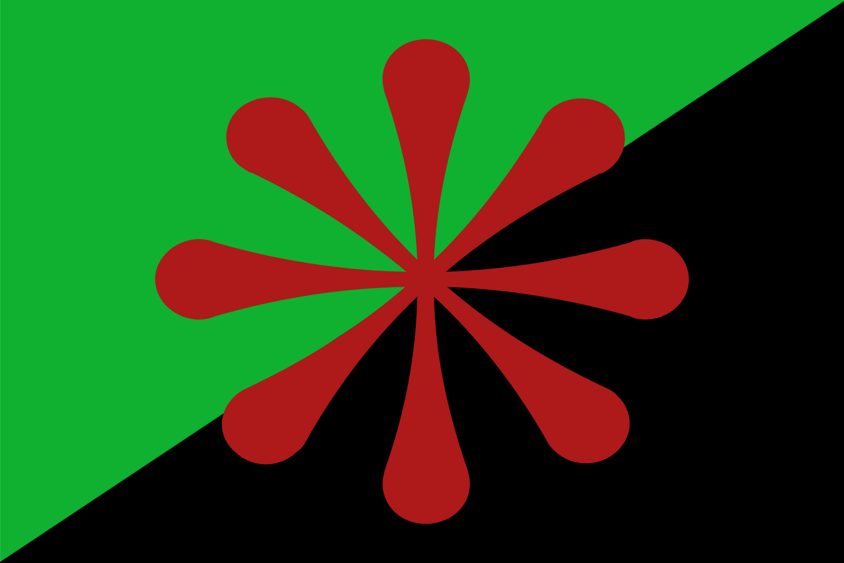
The green represents the need for an emphasis on ecological change, whilst the black is in reference to the black anarchist flag (here’s some historical context).
The red 8-sided asterisk represents the urgency for communities to cooperate in ridding the planet of eco-fascism. I picked the 8-sided one to represent the worldwide need for change.
unfortunately today the asterisk makes it look like an AI buthole logo.
My final rendition (which I’ll post tomorrow)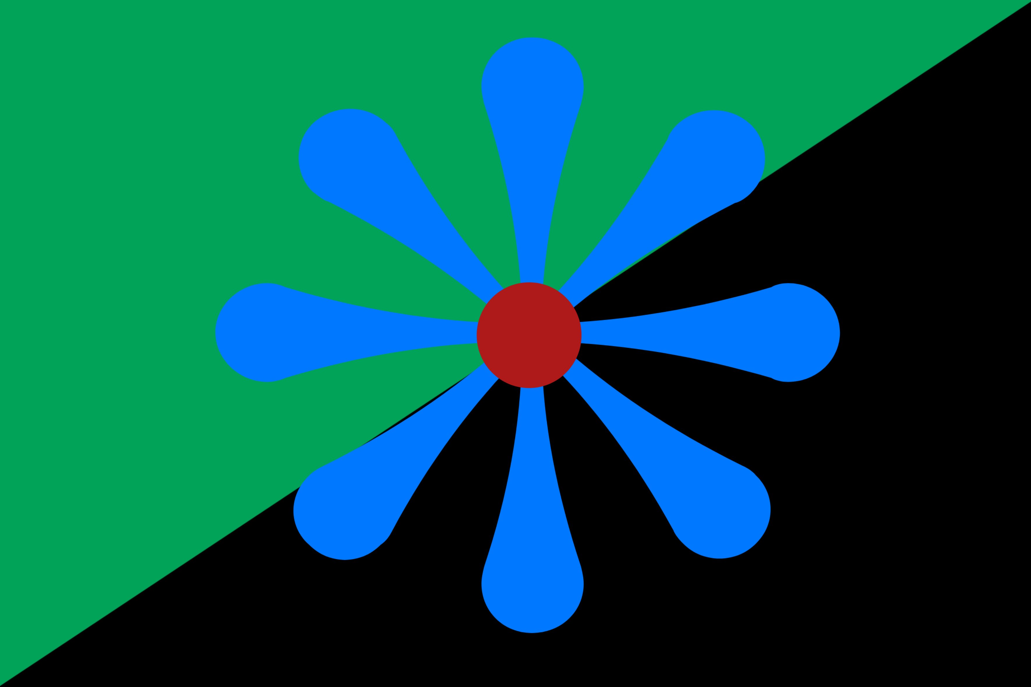
No offense, but it’s still a butthole and is still giving pro-AI vibes. Looks a lot like Claude’s logo.
The opposite color helps, but you might want to rework the “spoke/asterisk” look.
@thoughtfuldragon@lemmy.blahaj.zone @lavenderbreton@slrpnk.net I guess this is more of an “eyes of the beholder” situation because, at least to me, for example, it looks like the Romani / Saint Sara Kali symbol (although hers have 16 negative-shape radii circumscribed like a water wheel, while OP’s is an 8 positive-shape radii not circumscribed; maybe the color and shape similarity of the radii are leading me to see the Romanii symbol; the flag of India is also similar).
!flippanarchy@lemmy.dbzer0.com