

You must log in or # to comment.
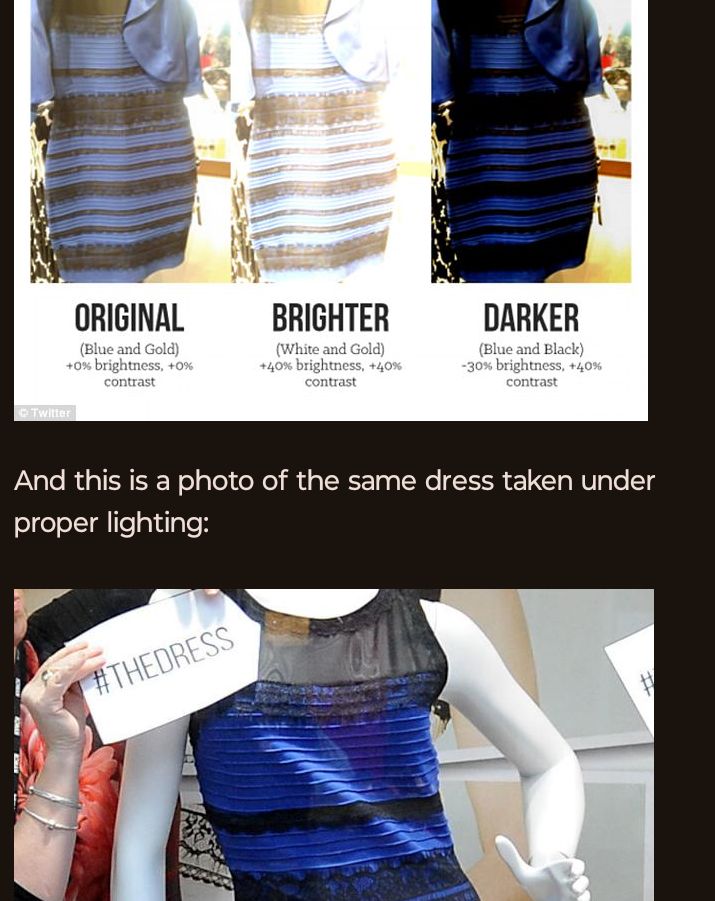
Because no one has posted the other photos:

And this is a photo of the same dress taken under proper lighting:

Not even the brighter version looks white and gold to me. It’s so obviously blue and black, y’all are insane.
I understand doubting the white but seeing black in that gold was what I could never buy. To me it seemed like light blue-grey with matte gold.
I’m with you. This viral moment never made sense to me cuz I can never see anything else even with my wildest imagination.
That’s…why it went viral. So many people couldn’t see it the other way, and both sides found it hard to believe that the other side was actually being sincere.
I’m the opposite, the OG photo reads white and gold no matter what edits I see. Even after seeing the dress in proper light the OG is still white and gold.
Let’s do this again!
Seriously WTF??? It’s freakin white.and.gold.
What on earth are you talking about.
Only the ‘darker’ picture looks remotely blue and black
Just curious. If you look at the dress at the bottom, and let your peripherals see the dresses up top slowly, then look up to the dresses on top, do you see them in blue/black then? Happened for me, then even when I scrolled up to the other pictures they stayed blue/black for a while.
Does not help me to see it the other way.
Thanks for confirming. My eyes adjusted when I did so and then as I scrolled back up even the on where they used the color pallet had changed to my vision. Next day saw it as white, and did the same thing again. The brain is weird.
When i first opened the image, it was undeniably white/gold to me, and I could not trick myself into seeing black/blue. After looking at the HQ image above, now I can not see white/gold anymore.
Edit: After writing this comment, it is back to white/gold.
Had the same happen to me
Right? To be white and gold the dress would need to be in shadow, but it’s clearly in light.
Same, I see light blue and still black
Zoom in or sample the colours. They’re not blue and black.
No way, really ? I really thought it was always white and gold. This cannot be the same dress, I do not trust my eyes anymore
All three of these look blue and black just with different levels of saturation?? I can understand how people can maybe see the gold, but interpreting the blue as white is baffling to me. Bluer than the day sky.
Left: blue and black.
Middle: light blue and black.
Right: dark blue and black.The dress is blue and black. It will never be white or gold. The lighting or saturation doesn’t matter.
Well the pixels themselves are white and gold so…
I have always only seen black and blue, even in the light version my brain doesn’t make it gold and white. It’s strange to me why people perceive this as gold.
Edit this video was the only one to make me see it https://youtu.be/YB36n00NHBw
We’ll I watched the other video and I finally saw the blue and black. I’ve always seen white gold but now I don’t. Fucking trippy.
Even with my phone cranked all the way up it still looks blue to me. I’ve never been able to see the white and gold version people claim exists.
Maybe my comment can help
For your information : the dress is really blue and black, according to the store and manufacturer. The vast majority of people see it as white and gold, but I personally think most people are not used to decrypting overexposed pictures, hence their inability to perceive the right colors.
overexposure is not the issue but improper white balance, the camera was probably set for ~6800K but the lighting in the room was ~2700K
I’ve never seen it at white and gold. Even the brightened photo, while I understand what’s happening to make people see white and gold, is still blueish/purple and black to me. Does that mean I have a tumor?
deleted by creator
Hey, I have friends who are white and gold… I’ve worked with white and golds.
It’s subconscious it’s not something you can learn. If that were the case people would have no issue understanding how others weren’t ‘decrypting’ the photo.
Also the majority see it as blue and black. 30% as white and gold.
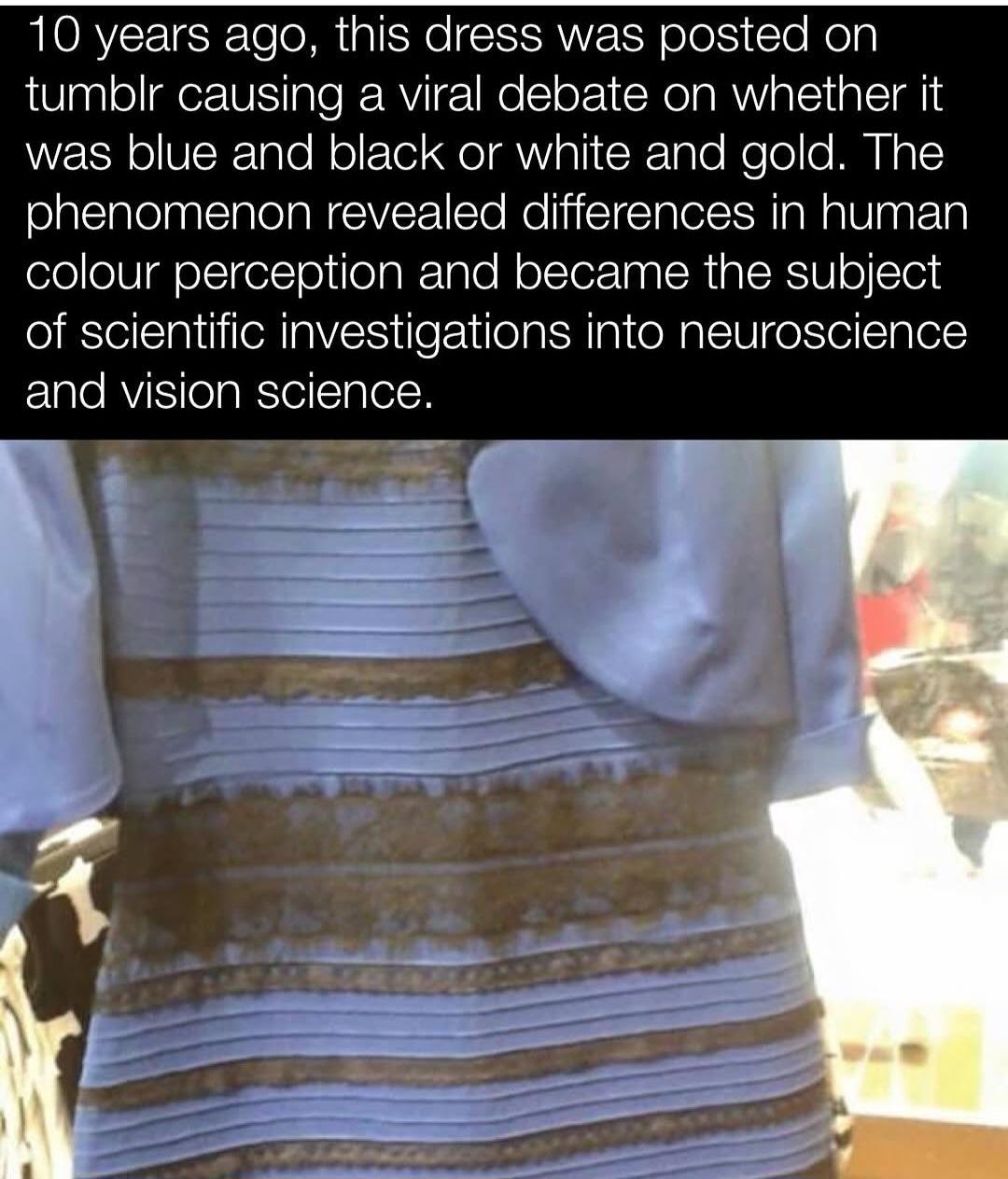
The Journal of Vision, a scientific journal about vision research, announced in March 2015 that a special issue about the dress would be published with the title A Dress Rehearsal for Vision Science.
The first large-scale scientific study on the dress was published in Current Biology three months after the image went viral. The study, which involved 1,400 respondents, found that 57 per cent saw the dress as blue and black, 30 per cent saw it as white and gold, 11 per cent saw it as blue and brown, and two per cent reported it as “other”. Women and older people disproportionately saw the dress as white and gold. The researchers further found that, if the dress was shown in artificial yellow-coloured lighting, almost all respondents saw the dress as black and blue, while they saw it as white and gold if the simulated lighting had a blue bias.
Another study in the Journal of Vision, by Pascal Wallisch, found that people who were early risers were more likely to think the dress was lit by natural light, perceiving it as white and gold, and that “night owls” saw the dress as blue and black.
A study carried out by Schlaffke et al. reported that individuals who saw the dress as white and gold showed increased activity in the frontal and parietal regions of the brain. These areas are thought to be critical in higher cognition activities such as top-down modulation in visual perception
Wow you figured out how to break JPG encryption? Someone call Alan Turing, we got a prodigy over here
I’m French, we often use comparable actions verbs even if it’s not their real context. More commonly known as the metaphore stylistic device.
I’m not French, we also do it, it’s commonly done and you were completely legible. Dude needs to chill
Is it common for the French to put together random semi-related, mostly nonsense words to try and sound like you know what you’re talking about?
I have not enjoyed passing through your comments in this thread
No need to be so sassy c’mon
Being sassy is fine, but being sassy and incorrect makes you look silly.
Just calling em like I see em, but fine. Carry on with the nonsense
I was gonna let you be stupid without saying anything, but you doubled down twice so now I will prove that you are wrong.
The first definition of decrypt in the American Heritage Dictionary is “To Decipher” I’ll admit, not super helpful, so let’s look at the definition of decipher. “To read or interpret (ambiguous, obscure, or illegible matter)”
So for someone to “decrypt” an overexposed picture, they would be, by dictionary definition, trying to interpret what the ambiguous picture was actually showing, since the lighting was making it unclear.
You are in the wrong when saying they used the wrong word, you just don’t have as good a command over the English language as you thought
Do you see em as white and gold?
Sounds like you need to open a dictionary ! It’s one of those big, stern books. Books are those stacks of paper bound together on one side.
Decrypt is closely related to the word “interpret”, which is something I personally interpreted from a history of decrypting English text written by nonnative speakers on the internet. 👍
The same words often have different meanings in different countries; something you should take into account in case you ever decide to take a German gift from a slim Dutchman.
“Decipher” is a mostly synonymous word which is more commonly used in that context.
It appears white/gold to me on it’s own, I’ve never been able to see anything different.
Grabbing this specific image and sampling the colours though; they appear more of a grey/brown colour. I can sorta maybe understand blue, but definitely not black.
This is just using Polish photo editor on android:

This is exactly the thing.
Whatever the dress may be in reality, the photo of it that was circulated was either exposed or twiddled with such that the pixels it’s made of are indeed slightly bluish grey trending towards white (i.e. above 50% grey) and tanish browny gold.
That is absolutely not up for debate. Those are the color values of those pixels, end of discussion.
Edit to add: This entire debacle is a fascinating case of people either failing to or refusing to separate the concept of a physical object versus its very inaccurate representation. The photograph of the object is not the object: ce n’est pas une robe.
The people going around in this thread and elsewhere putting people down and calling them “stupid” or whatever else only because they know that the physical dress itself is black and blue based on external information are studiously ignoring the fact that this is not what the photograph of it shows. That’s because the photograph is extremely cooked and is not an accurate depiction. The debate only exists at all if one party or the other does not have the complete set of information, and at this point in history now that this stupid meme has been driven into the ground quite thoroughly I should hope that all of us do.
It’s true that our brains can and will interpret false color data based on either context or surrounding contrast, and it’s possible that somebody deliberately messed with the original image to amplify this effect in the first place. But the fact remains that arguing about what the dress is versus how it’s been inaccurately depicted is stupid, and anyone still trying that at this late stage is probably doing so in bad faith.
The “white” pixels are literally blue. The “black” ones can be considered gold due to the lighting.

You missed the whole point. If I take a white dress and then shine a blue lamp on it, then take a photo.The pixels will be 100% blue, but would that mean the dress itself is blue?
But you can clearly see that the lighting is bright yellow-white, not blue…
The yellow background could be lit by another window or a different light source, so one could argue we don’t have a good reference to tell. But the point is that the “picture of a thing” is not “the thing” itself, and there is always a possibility that they are different.
deleted by creator
That is literally what the argument is caused by, adaptive perception to lighting conditions.
deleted by creator
It’s exactly the point. White fabric will appear blue in blue light, which is why some people see this white dress and think it’s blue.
If I showed you a picture of a green surface, and asked you what color it is, would you say that it’s white and that there’s probably green light shining on it?
No, but it doesn’t mean the other answer is invalid too. If there is no reference in the picture to tell what kind of light condition it was shot at, both answers could be possible.
So if we’re just going by what’s possible then the wall could be yellow and have a blue light, or it could be white with one yellow and one blue light.
Yes a very light blue, nobody is seeing brilliant white. But on a colour slider it’s much closer to white than the ‘true’ dark blue of the dress. If you sample the sleeve or whatever that is hanging over it’ll be even closer to pure white.
They’re not stupid, their visual cortex just lacks the ability to calibrate to context. You can see in the picture that the scene is very brightly lit. If your visual cortex is in working order, you’ll adjust your perception of the colours. The picture reveals that some people struggle to do that.
fMRI studies show that white-and-gold perceivers exhibit more activity in frontal and parietal brain regions, suggesting that their interpretation involves more top-down processing. This means they are more, not less, engaged in contextual interpretation.
Some differences may relate to physiological traits like macular pigment density, which affects how much blue light is absorbed before reaching the retina. People with higher density tend to see white and gold
Color perception is not only about the visual cortex’s function but about the image’s properties and the brain’s inferential processes. You’d know this if you weren’t a dumb blue-n-black’er
How come the gold and whiters are simultaneously claiming they use more top down processing, AND that the pixels are white and gold? Looking at the pixel colour is bottom up processing.
If the dress is actually blue and black, how is doing more contextual processing supposed to get you a less accurate perception? Imagine if it was a snake and you needed to tell what colour it was so you’d know if it’s going to bite you. If your perception of the snake’s colour changes depending on the lighting, you’re going to die.
The correct interpretation of that study is that you white and golders are doing 10,000 calculations per second and they’re all wrong… Or, you know, the BOLD activation was in inhibitory pathways.
The claim mixes up how perception works and what people actually mean when they talk about top-down processing. White and gold viewers aren’t saying the pixels are literally white and gold—they’re saying the colors they perceive match most closely with that label, especially when those were the only options given. Many of them describe seeing pale blue and brown, which are the actual pixel values. That’s not bottom-up processing in the strict sense, because even that perception is shaped by how the brain interprets the image based on assumed lighting. You don’t just see wavelengths—you see surfaces under conditions your brain is constantly estimating. The dress image is ambiguous, so different people lock into different lighting models early in the process, and that influences what the colors look like. The snake example doesn’t hold up either. If the lighting changes and your perception doesn’t adjust, that’s when you’re more likely to get the snake’s color wrong. Contextual correction helps you survive, it doesn’t kill you. As for the brain scan data, higher activity in certain areas means more cognitive involvement, not necessarily error. There’s no evidence those areas were just shutting things down. The image is unstable, people resolve it differently, and that difference shows up in brain activity.
White and gold viewers aren’t saying the pixels are literally white and gold—they’re saying the colors they perceive match most closely with that label
I think all of the white-gold people are really condescending, explaining how their perception is correct and how blue-black people don’t understand the image. Also, if they explain how the image looks white-gold enough, that the blue-black people will be wrong.
explaining how their perception is correct and how blue-black people don’t understand the image.
Well the ones that do understand the image by definition won’t need it explained. There’s no ‘correct’, if we’re talking pixels/digital representation, it’s white-gold (or light-blue and brown if we’re being pedantic), if we’re talking about what the physical dress is, it’s blue and black.
If it were a white and gold dress and the light was reversed to shadow it’d likely be the other way about; some people would interpret it as the pixels displayed (blue and black), and others would subconsciously revert it to white and gold.
So you’re saying if there were a blue and black snake that bites with deadly venom, and a white and gold snake that’s harmless to people, you’d gain an evolutionary advantage from seeing the blue and black snake turn white and gold in the sun?
No, being able to see the same snake as the same colour by adjusting for ambient lighting conditions aids survival.
That isn’t what’s happening it’s a low res overexposed photo that lacks visual cues not real life.
Earlier today I was sat in a dark room reading this thread, I looked at the picture above and it clearly had blue tones with warm dark grey. The dress was obviously blue/black.
I’m sitting outside in the light now, looking at the same picture on the same phone in the same app and now it’s white and gold/brown.
Without going on my pc and colour picking it myself I can’t tell what colour the picture really is since my eyes seem all to happy to lie to me about it.
Why not an American photo editor?
A) I’m not American
And
B) America can go fuck itself until it sorts out it’s Nazi problem. I still think Canada should enact a full trade embargo and take our business elsewhere.
I mean… it was a dumb joke on Polish and Polish being homographs, but okay.
Woops
I missed that; bit of a sensitive topic atm…
Why are people downvoting someone for admitting they made a mistake? It takes some courage to do that.
deleted by creator
It’s funny how people will keep barking about it even when you slap them in the face with color picker which is mathematical display of the color. There is no “how brain is seeing things”. It’s literally WHAT THE COLOR IS. To call white with faint blue tint “blue” and what is clearly a “gold” shade can’t possibly be black. If photo was heavily manipulated through photo editing or lighting, that doesn’t prove anything at all. Or the question was stupid. No one was really asking “what color is the dress”, they were asking what colors are on the photo. And photo has no relation to the real dress because of light conditions manipulation or even photo editing.
This is the color picker in the image you replied to. Do you really think the colors on the left are white and the colors on the right are gold?

This person doesn’t understand pixels lol. You picked one pixel. Pick 100 of them and average them. It’s in the white spectrum with a slight shade of blue hue. If you look at it on the color wheel, it’s well within white segment slightly towards the blue. When you zoom out of single pixels, it’s white that you get under cool white light. It’s still considered white.
As for gold, computer screens do not display gold in specular way how you see it with eyes.When you pick pixels, they will be in range of brown. Again, you don’t seem to underetand pixels. And ultimately, this is suppose to be black, remember? Where’s the black?
The “after” photos of a dress show dark blue with black lace details because it was not captured in bullshit lighting. Where is that on the picked pixels? Just like years ago we are once again arguing over bullshit doctored/manipulated/bad photo of a dress arguing what color it is. It’s beyond stupid and I can’t believe people are still this dumb to argue about colors that aren’t even there. I don’t care how dress actually looks, you showed me the photo of it and you’re asking me how the dress looks like on the photo, not in reality. The rest is within the color picker which is mathematical representation of colors that doesn’t give a shit how eyes work. And it picks very faint blue and brown (thats perceived by eyes as white and gold). Not dark blue and black.
You are absolutely right. How most people don’t seem to get this fact is beyond me.
No one was really asking “what color is the dress”, they were asking what colors are on the photo.
This is not my recollection of this at all. Everyone knows what physical colors are on the screen. If so people who see the image as white and gold wouldn’t have been shocked/angry to learn the dress is actually blue and black.
If they were asking about actual color of the dress that you cannot see, what the fuck is the point? That’s like saying, we put orange cat in fully closed box. What color is the cat? And you then claim it’s not orange, it’s black because there is no light inside the fully closed box so the cat is actually black. That’s the level of stupid argument with this stupid ass dress.
I can also shoot a white dress to look entirely blue because I’m gonna use cool white light at 9000 fucking Kelvins and fuck up the cameras white balance to make shit look anything but its actual color. I can also take a normal photo and then just drag some sliders in photo editor and fuck up colors and then ask some bullshit question about colors and then go like “well, achtually it’s not that color”.
It’s also funny when people argue it’s not actually white because color picker says it’s light blue. Firstly, color motherfucking temperature. Secondly, open color wheel and see where it’s positioned. It’s in the white segment mildly nudging towards blue. The part where I’m not gonna argue is perception of gradients. This isn’t “this gold color is actually black bullshit”, but actual science where people perceive correct colors differently. For someone a certain gradient of red is perceived as lighter or darker compared to someone else. But certainly isn’t perceived as green. Or black. Or whatever other basic color.
It’s also funny when people argue it’s not actually white because color picker says it’s light blue. Firstly, color motherfucking temperature.
It’s because it seems like about half of people’s eyes and brains correct it one way and the other half the other way, leading to extremely heated discussions about “how can you not see it my way.” This isn’t like other optical illusions like that silhouette of a spinning ballerina where you can easily flip it around in your mind. I’ve only ever seen this as white and gold once and it took someone putting it upside down and very slowly zooming out from a very specific area of the dress.
So that’s why people were so torn about it.
Next up: the dress worn by the woman on the right.

The point has never been about the actual pixel color codes. It’s about how human perception doesn’t follow those objective metrics.
Distilled down, we perceive color and brightness in comparison to the surrounding scene. The checker shadow illusion is a clear example of the same color looking different.
So the color perception on the dress depends on how the brain decides to color correct the white balance of the scene.
I find it easy to switch back and forth between the two color combinations: If I assume that the scene is in full sun, then the dress looks blue and black. If I assume that it’s in the shade, but with a brightly-lit background, then it looks white and gold.
For the millionth time, the camera perceived it that way, not a human eye.
You should watch https://youtu.be/bg41XfnIBvk for an explanation on how to properly get the colors from the image.
I still don’t see either. It looks blue and gold to me
Me too!
Same!
Strangely enough, I saw it as black and dark blue at first, but then something switched and I’ve been seeing it as light blue and gold ever since!
THANK YOU
This is the first time I’ve seen this take upvoted.
Same. Initially white and gold, but now mostly blue and gold, although if I stare at it I can make it change back and forth.
Don’t forget Laurel and Yani!
I like Brainstorm vs Green Needle even better. The’re not even the same amount of syllables! https://www.youtube.com/watch?v=1okD66RmktA
Ok this one is crazy, because I hear whatever I’m consciously thinking of. “Brainstorm”, “green needle”, “brain needle”, “green storm”. It’s actually tripping me out.
Btw I still hear “laurel” every time. I can hear “yanny” in the background if I really focus, but I always hear “laurel” as well.
Craziest one that’s worked on me seeing both. Only hear yanny, no concept of laurel
i hear Laurel at high volumes and Yanny at low volumes, and if i turn down/up the volume little by little i can hear the same one across all volumes ( brain resets after a few seconds of not listening)
Team Yanny
I always heard yarrel. Or yarrey, but I don’t hear l sound at the start or n sound in the middle. So neither?
Oh thank god, i thought i was insane for hearing yarrey
I hear it as “Yammi” and see the dress as light blue and gold.
Of course, both are the only objectively correct answers 😉
I hear pancaked!
I hear both simultaneously at different frequency. Yanny is way higher.
I hate that one because I hear both of them at the same time Dx feels like pure insanity.
And the trainer.
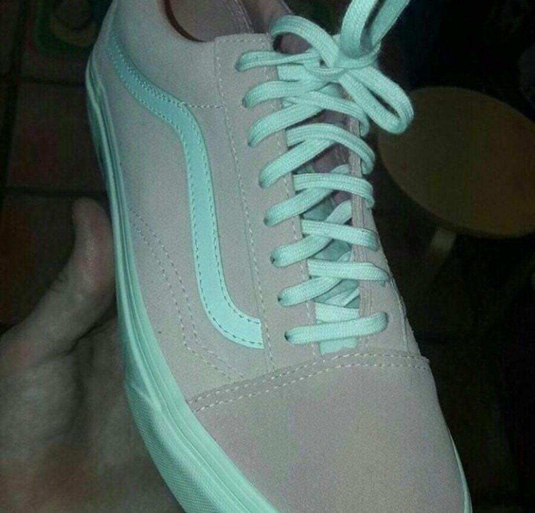
The dress was always blue and black to me (blue and copper tinged black really), but this one keeps switching from grey and mint to pink and white and then back again.
I found this image to be a really good way to distill the issue down into the two different modes or perception:
https://en.m.wikipedia.org/wiki/The_dress#/media/File:Wikipe-tan_wearing_The_Dress_reduced.svg
Oh wild. When I first saw this on lemmy it was white and gold. Then I clicked the image and looked and thought, “yeah, that’s what I figured.” Then I scrolled up and it was blue and brown. Can see white and gold again. Fun.
I looked at this a few hours back when the sun was shining. Obviously white and gold, no question. Looked at it again just now after the sun went down and the house was darker. It’s blue and black. I can’t see how it could be white and gold. I’m not sure if this is some joke and I’m being fucked with here, so I’ve downloaded the image and I’ll take another look when the sun’s shining again.
Another fun trick is being able to flip which way you think the ballerina is spinning. I used to be able to do it. Helluva time right now, though.
I initially saw black and blue, but after scrolling to the top of this thread yesterday I could only see white and gold and again today, even zooming in.
Immediately switched to black and blue after reading that.
The mind is a fascinating thing.
Edit: Holy crap I’m back to white and gold.
To me the background looks more like the left.
Never understood this one, or believed anyone who said they saw black/blue. You can zoom in and colour pick, the colours are measurable and objectively gold and blue-white.
I see white/gold too, and this always fascinated me because I’m wrong. The real dress is black/blue. It’s very hard for me to perceive that way, partly due to the bad quality picture, and particularly the background lighting.
The gold is black and the white is a dark blue irl, but in the bad coloring/lighting of the picture, the deep blue is quite washed out. Know that the colors are very washed out, know that the “gold” is black. Focus on the lower left where the colors are closest to true and block out the rest, especially the bright parts. The thick black stripe in the middle can also be a good spot to start to see it.
Were taking about the pixels on the screen, not the real dress though, the colors on screen are what you see and theyre gold and blue-white

Show me the white here. I thought gold was like a yellow orange, not a brown-grey color
Thats the blue-white. Or light blue.
When I first saw the pic it was clearly blue/black. I laughed out loud when my wife asked me about the white/gold dress. I showed her my phone, and she agreed she could kinda see the blue black. She showed me hers, and I could kinda make out the white gold.
The device you view it on matters, and the lighting around you. For a while I could switch between them with concentration.
This pic is obviously white/gold.
When you look at the checker shadow illusion, do you see the pixels as identical in color? If not, then obviously there’s more to human perception than just the color of the pixel code.
That is witchcraft.
Depends on whether I zoom in so the color fills the screen or not. This doesn’t change the color values that appear on the screen.
It sounds like you’re agreeing with me that color perception relies on context, not just the color code of the pixel on the screen.
deleted by creator
Since we have no context, the dress is white and gold objectively.
The actual physical object photographed is black and blue.
White and gold appear when the brain makes the assumption that the dress falls within a shadow (effectively applying a filter that shifts the white balance towards bluer colors and brightness down significantly compared to direct sunlight). Only in real life, the photographed dress did not fall within a shadow, and instead was affected by a yellowish lens flare, so the subconscious color correction that leads a viewer to assume white and gold was erroneously applied.
I see white and gold. But to claim that it’s “objectively” white and gold ignores how the human brain perceives color and ignores that the actual photograph was a blue and black dress.
deleted by creator
This dress is black and blue. I am laughing hysterically that any of you think it’s not. Is your eyesight bad in other ways? Honestly asking because mine is really good.
I regularly colour-match clothes as part of my retouching work. My eyes are fine otherwise I wouldn’t be trusted with critical color work.
Idk there is no universe in which this is anything but blue and black.
Yeah, and then people started posting comparison shots of what both groups of people see, side by side. One dress clearly being blue/black, and the other being clearly white/gold.
I just remember thinking to myself how people can look at that and still believe in nonsense. If there really was something going on with the colors, light wavelength, etc. we’d just be looking at a side-by-side image of two identical dresses, like looking at a stereoscopic image.
How does it feel to be objectively wrong?
This isn’t the picture they used at the time either, why are we cropping it now?
I’m the exact opposite. When somebody first showed me the picture, I thought “is this some kind of trick question? It’s obviously black and blue”. And still to this day, after many arguments with (friends and family) as what I can only perceive as stubborn defensiveness, I can still only ever perceive it as black and blue.
I literally cannot override my color perception to trick myself into seeing white and gold and it feels like a mistake a lot of people made (to see white and gold) and then just stuck with and argued for (“it’s an optical illusion!” or “look at the pixels!”).
Even if you zoom in really far? Thats what I cant wrap my head around. The colour is so far from black I cant see how anyone would interpret it as black.
Definitely. Part of how it works for me, is I see the lighting around the space, and how white/bright looks, and how it’s VERY different from the dress.
So then my brain picks up on how light in the image works, and then makes a profile that the camera is shitty in a shitty environment, and how to interpret color and context.
Only after that does my brain decipher what’s in the picture, being The Dress®
I would argue that if somebody de-blurred the picture, and cut out the dress apart from the background, and just had the dress…
Hmmm… Nah, because… even then, I can see how the seams are basically black or far darker blue (like in the shading), and not actual white or gold.
Yeah I just don’t get how white and gold is seen.
I literally cannot override my color perception to trick myself […]
If biology had intent, I’d think this is intentional. You’re not supposed to be able to do that.
Once your brain decides on a context, that becomes the (percieved) truth, and it’ll take a lot of new information to change your mind because your brain will invent reasons why what you’re seeing is correct. Your brain makes up a story, that story seems to make sense, and so new perceptions not only need to make sense but also disprove the story it has.
Take, for instance, this silhouette. It has no lines to indicate depth, but I bet you’ll settle on a mental 3D model—you’ll be able to see where the hips end, which leg is doing what—and it’ll be really hard to switch perception from spinning one direction to spinning the other.
No see, with that, I can switch back and forth. It’s trippy, but I can. Which is why the dress thing is so weird: I’ve tried many times (over the last…shudders decade).
That’s why I find the dress kind of an outlier and actual doubt. It just doesn’t add up to me because I can’t seem to switch to white-gold.
But then, also, going off the different people here, I also find it hard to believe there would be what looks like 40-45% of people who still are the exact opposite, in only being able to see white-gold, rather than blue black.
Like I get how technically, “the pixels…”, but that doesn’t explain to me how there’s like a near-50% of people (at least the English-speaking internet demographic) that are… To put it bluntly, seemingly deficient. It would be one thing if there was no definitive proof of what color the dress actually is, or if it was just “some people see it start out one way and other people see it the other way, but then both people could switch between”, but it’s evidently NOT that - it’s that some people are just stuck unable to interpret the color in a shitty picture correctly, and that other people are unable to interpret it wrongly (and maybe a smaller chunk of people who are able to go back and forth, but then that presents even more discussions).
There’s a lot going on here, both psycho-optically, psychologically, and socially, and I don’t think internet forums/social media that can’t isolate, drill down, and then research the different sections of the blue-black/white-gold dress phenomenon should be bringing it up (though good luck with that) and basically just flaming and trolling each other in such a… Cognitively shallow way.
It’s worth examining, absolutely. But absolutely not in this format.
You never understood it because you are wrong. If you actually *color pick you will see that it is blue and black. Not only are you eyes/brain incorrect, but the original dress is actually blue and black.
I love how people keep saying this without actually picking the colours. There’s no black pixels on there at all.
I did that in photoshop and it confirned what my eyes saw
I’ve only ever seen it as blue and black. I can’t force it the other way like I could with Laurel and Yani. Y’all seeing white and gold astound me.
Crazy talk. White and gold only
I still think the white and gold people are trolling.
Same. But now after all these years, there are enough people in here that are pedants/trolls and flatly saying they can only see white and gold.
It makes me question my own abilities. Sure, I see the dress for what it actually is, but am I lacking the ability to trick my brain into seeing an illusion? Is that a lack of something like imagination? Am I broken?
I never really understood the debate. In reality, if you were standing in front of the dress it is black and blue. Now, if you take a digital photo of the dress and post it on the internet as a terribly compressed jpg, with weird white balancing, and brightness/contrast turned up and down it is gold and white. The debate isn’t really about the reality of the color of the dress but the reality of a badly edited photo.
It’s more about the colors around it. This image from Wikipedia does a really good job illustrating the effect.
Context is extremely important in identifying color. As Technology Connections tells us, for example, “brown is just orange with context.”
What always confused me is, the picture clearly seems to be overexposed, which means the blue/black interpretation should be obvious.
I agree. But my wife was so firmly in the white/gold camp that I had to find this (and a better image of the actual dress, which is indeed blue and black) to help us understand one another’s perspective.
It’s because we’re also very used to seeing photographs of a subject in shade while the background is in full sunlight. If you take a picture of a white and gold dress in the shadow of a patio, with the background all fully lit by bright sunlight, the actual pixels representing white objects in the shade would be that bluish gray tint.
The problem here is that the dress isn’t in the shade but those of us who see white and gold simply assume that it is in shade, while black/blue viewers (correctly) assume that it is under the same lighting conditions of the overexposed background.
This thread has been helpful for understanding how others could see it as white and gold; I never realized people were actually seeing it as in shadow even given the context of the rest of the picture.
And what everyone seemed to omit: the reality of peoples’ wildly uncalibrated monitors/phone screens.
Properly calibrated screen for graphic design here, multiple mobile devices. Never any major variance unless it’s a different image.
if you take a digital photo of the [ … thing … ] and post it on the internet as a terribly compressed jpg
That sums up the entirety of the content on a number of popular subs on the R-word site.
Confusing perspective? No. More like confusing JPEG artifacts.
You used to be able to report shit for not being confusing, but it was placebo at best. That site sucks so much.
Is it, though? Is this dress in the pic only white and gold to everyone who looks at the picture/the original?
deleted by creator
it has always looked light blue-ish, like a periwinkle, and gold to me, as well
I swear this is a gif with very long loop time. I see it black and blue 90% of the time and the its in my feed and bang, white and gold… and I can’t change it no matter what I try.
I can never see black and blue. I assume all those who claim to see black and blue are bots. fite me
So people looking at this photograph actually can perceive this to be white and gold? thats utterly wild. And hard to believe.
I remember seeing different colors on different screens, so I think part of the perception difference are the saturation and brightness settings of your screen
Yeah that definitely has an influence as well. If I tilt my screen I can make it more blue and black, but straight on it’s white and gold.
Yeah when I first saw the post, it was white and gold, then I read your comment and turned the brightness off my phone all the way down an now it’s black and blue.
We all are black when the lights go out.
It bothers me how far I had to dig for someone saying this. Obviously this isn’t some deep insight on how people see colors, we are literally not looking at the same washed out photo because we all have different devices with different settings.
This is like those math problems people argue about because someone purposefully wrote it ambiguously. Manufactured problems.
whats next? are you gonna post who remembers yanny/laurel? bitch be fr
the first time ever I see this image, years ago, I could see both white-gold and black-blue. I don’t know why I can only see white-gold now.
but assuming the bright light in the back is warm sun light, I think this is why my brain is more accepting that the blue tint is more of a shaded area from the sun, while the base color is white. the yellow-blue contrast
When this first made the rounds I managed to see the gold-white a few times, but it’s almost always blue-black for me.
Same


